Advertisement






The Gulf conflict has disrupted global supply chains, pushed...
REITs have changed the way commercial real estate is owned a...
What really powers the cloud? Behind every Google search, A...
What really powers the cloud? Behind every Google search, A...
Luxury real estate is one of the most talked-about segments ...
Mumbai-based Mayfair Housing has introduced a new brand identity as the 62-year-old real estate company expands across key micro-markets in the Mumbai Metropolitan Region and Ahmedabad. The refreshed identity includes a simplified logo, refined wordmark and unified visual system intended to provide greater consistency across digital, print and physical customer touchpoints. The new geometric symbol retains the company’s familiar triangular character and established red, green, orange and blue colour palette, while incorporating three directional elements inspired by a pinwheel. Mayfair Housing said the redesign retains its brand promise, ‘Appreciating You.’ and its four brand pillars — Safe, Appreciating, Reliable and Asset (SARA). The company has delivered more than 100 projects across MMR covering over 1 crore sq ft and redeveloped more than 30 housing societies. Its current development pipeline exceeds 40 lakh sq ft.
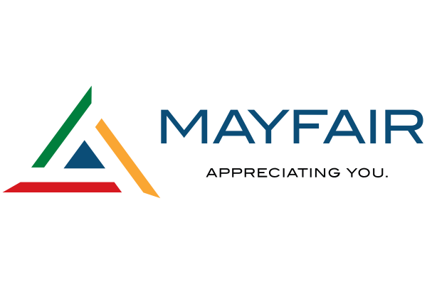
Mayfair Housing has launched a new brand identity as the Mumbai-based developer enters a new phase of expansion across key micro-markets in the Mumbai Metropolitan Region (MMR) and Ahmedabad. The 62-year-old company announced the refreshed identity on 28 September, comprising a simplified logo, refined wordmark and unified visual system across its corporate and customer-facing communications.
The redesign retains recognisable elements of Mayfair Housing’s existing identity while introducing a more contemporary design intended for use across digital platforms, print material, project collateral, advertising, sales offices, signage and built environments. The company said the identity was developed to improve consistency and recognition as it engages with a new generation of homebuyers.
At the centre of the revised identity is a geometric symbol inspired by a pinwheel. Three directional elements converge within the symbol to represent evolution, balance and growth, while retaining the triangular form historically associated with the brand. The company’s established red, green, orange and blue colour palette has also been retained, although it will be applied through a more structured design system.
The new symbol is accompanied by a contemporary wordmark and the continuing brand promise, ‘Appreciating You.’ The broader visual system establishes standards covering typography, imagery, graphic language, signage, digital platforms, advertising, sales offices and other branded environments.
Mayfair Housing said the design was based on two concepts — the wheel of time and winds of change. The company associated the wheel with changing eras and customer expectations, while the winds represent adaptation and forward movement. It said the new identity was intended to reflect its evolution over six decades while retaining the values and culture on which the business was established.
Chairman Dr Nayan Arvind Shah said the new identity was intended to retain the trust, responsibility and commitment associated with Mayfair Housing while giving its legacy a contemporary expression. He said the simpler design would provide greater clarity and consistency across customer touchpoints, while ‘Appreciating You.’ would remain central to the brand.
Joint Managing Directors Aditya Nayan Shah and Anay Nayan Shah said the refreshed identity reflected the company’s expansion and its engagement with changing customer expectations and opportunities across the real estate sector. They said the redesign represented an effort to combine the company’s established values with its focus on innovation, customer engagement and growth.
The company’s brand framework is built around four pillars — Safe, Appreciating, Reliable and Asset, or SARA. These represent its stated focus on secure spaces, long-term value creation, consistent and responsible delivery, and development of assets intended to retain relevance over time.
Mayfair Housing said the new identity would be rolled out over the coming days across corporate communications, digital platforms, project material, advertising, sales offices, signage, workplaces and other customer-facing channels.
Over its 62-year history, the company has delivered more than 100 projects across MMR, covering over 1 crore sq ft. It has also redeveloped more than 30 housing societies and currently has a development pipeline exceeding 40 lakh sq ft.

20th Oct, 2026

3rd Oct, 2026

28th Sep, 2026
24th Sep, 2026



4th Aug, 2026

Advertisement








 Facebook
 Whatsapp

